We’re excited to announce Starfish Reviews 1.7! We’ve been listening to your feedback and have added some great new features we think you’ll love! Check out the details below.
Some Small Improvements
First a few small improvements we implemented to make the overall experience better and easier to use:
- On the Funnels list page, we added a column that indicates whether each funnel is a single or multi destination funnel.
- Now when you go to upload a custom destination icon, it opens the default “Add Media” modal from WordPress. So you can select an image already in your media library, or add one to it.
- We added some hover effects to custom destination buttons, so they react more like the built-in buttons.
See the full changelog for all changes and fixes.
New Pie Chart Showing Your Destinations
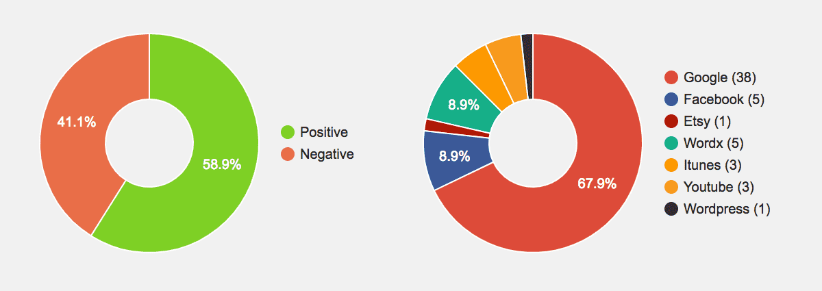
This one really helps you get a great overview of the feedback people have been providing via your Funnels. It’s a simple pie chart that shows what destinations people are selecting in your funnels. Like the positive/negative pie chart, it also reacts to the sorting/filtering options of the reviews screen. So you can limit it to a single funnel, date range, etc.
Drag ‘n’ Drop Reordering of Destinations
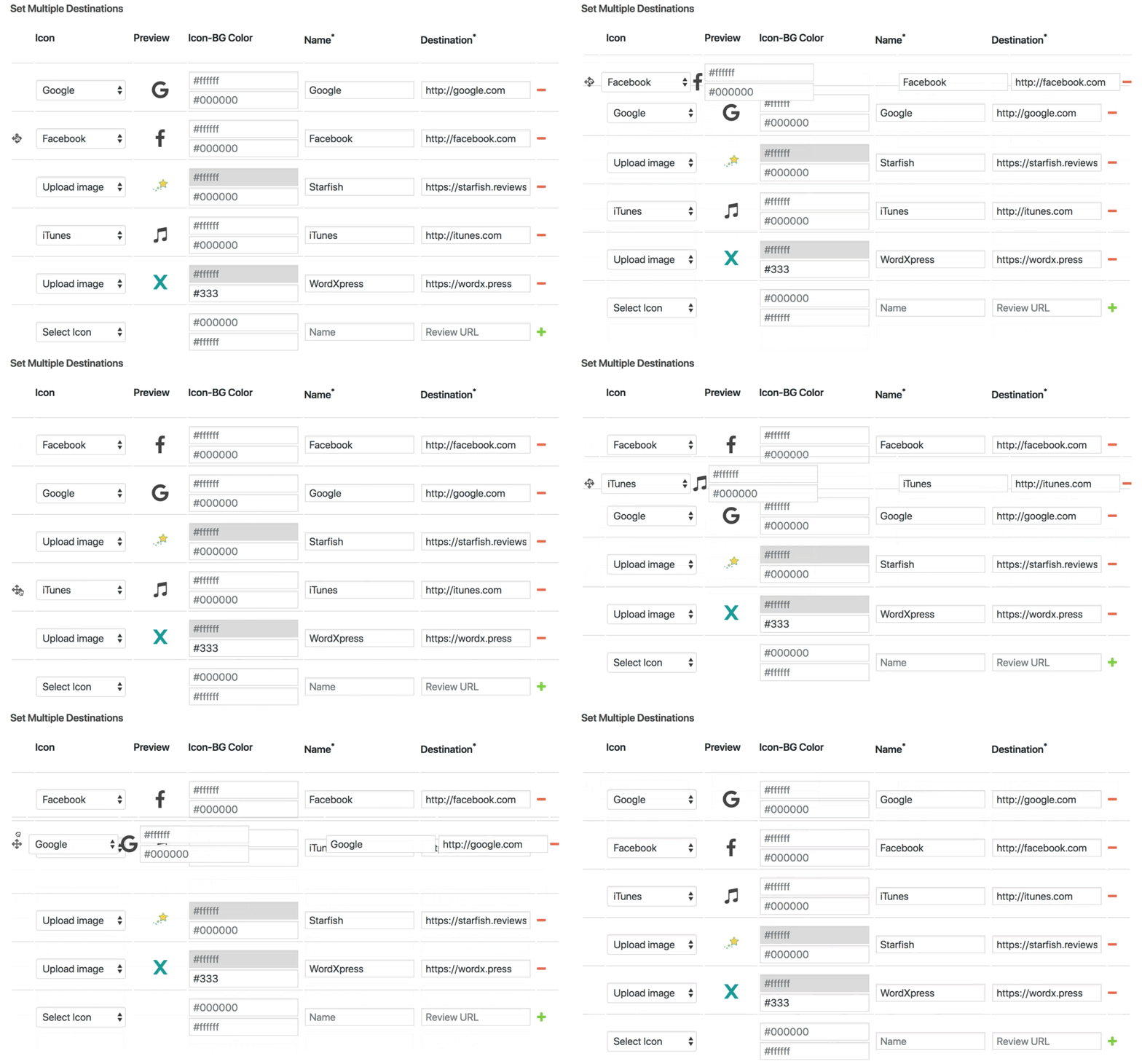
Did you add your destinations in the wrong order? Or perhaps you want to see if putting a different destination first, leads to it being selected more? In any case, you can easily drag and drop destinations in multi-destination funnels to the order you want! It’s very intuitive and works great! It’s probably easier to just show it than try and explain further:
Link to a Funnel With Feedback Pre-selected
One of our users had a great idea: allow users to link to a funnel with the positive/negative (thumbs up/down) option pre-selected. “What’s the point of that?” you might ask.
Well it’s simple: you can eliminate one click (one step, and one more layer of friction) from your reviews funnels with this feature. Instead of sending an email that says “click here to give feedback” and then take them to the funnel page to select thumbs up/down, you can skip a step by putting the question and the thumbs up/down (or whatever icons you want) into the email itself. Then link each icon to the preselected funnel url by adding the “?feedback=” query parameter on the end of the URL. You’ll link the images (or text links work too) in your review request emails using the new query string like this:
POSITIVE:
https://yourdomain.com/review/funnel/?feedback=p
NEGATIVE:
https://yourdomain.com/review/funnel/?feedback=n
And it works with the “?id=” query string as well. So you can set both like this (just insert your email app’s “subscriber email merge-tag” in place of “[user-email]”):
https://yourdomain.com/review/funnel/?id=[user-email]&feedback=p
Tell Us What You Think
What do you think? Are these features exciting, awesome, or just okay? Let us know in the comments. We’re always listening to our users and trying to build the best review marketing plugin for WordPress on the planet!



0 Comments