Reviews not only influence buyer decisions but also enhance a brand’s credibility and search engine ranking. With countless platforms and strategies available, finding the best way to showcase your review collection can be a daunting task. Well, we over at Starfish Reviews are here to help.
We will dive into integrating third-party review sites so that you can show off your most credible reviews. Whether you’re a small business owner, a digital marketer, or just curious about the best practices in review management, this guide will equip you with the knowledge to enhance your brand’s reputation and foster trust with your audience through Starfish Reviews’ intuitive features.
Starfish Reviews has a nifty feature called Review Collections. Collections showcase reviews you curate from any review platform you want to show reviews from.
The plugin’s primary purpose is to help you get more reviews by asking for them directly.
However, you can also import reviews from a variety of different review platforms and use Review Collections to showcase them. All you need to do is paste a Collection’s shortcode wherever you’d like to include it.
Starfish Reviews Premium allows you to create a maximum of between 5 and an unlimited number of collections (depending on your plan) so that you can display reviews from as many locations as you need.
In this post, we cover the best ways to display Review Collections on your site.
What are the Best Ways to Display Review Collections?
There are two primary ways to display Review Collections on your site:
- On an existing page.
- As the basis for a dedicated customer testimonial page.
The best existing pages to include reviews on are your Homepage and Pricing page.
A customer testimonial page is an entire page dedicated to sharing stories and testimonials from real customers who use your product or service.
Using an Existing Page vs a Customer Testimonial Page
The easiest way to display a Collection is by adding one to an existing page.
It’s a quick and easy way to utilize social proof, a social phenomenon that explains how we’re more likely to perform certain actions, such as buying products, based on the actions of others.
When potential customers read positive testimonials from other customers, they’re more likely to purchase your product or service.
The best part about Starfish Reviews’ Collections is that they pull real reviews from trusted platforms, giving them more credibility than text-based testimonials.
When you use Collections on existing pages, you’re taking advantage of a great opportunity to use social proof on your site’s most-visited pages.
A dedicated customer testimonial page kicks this up a few notches.
This type of page gives potential customers a deeper look into exactly what your product or service can do for them.
It essentially becomes another landing page, one that could output high conversion rates.
Great Examples of Customer Testimonial Pages
Let’s take a look at two real-world testimonial pages from these brands:
- Hotjar
- Codecademy
Hotjar
Hotjar is a user-behavior application whose testimonial page is simple, yet effective.

It starts with a two-column hero section that includes a short blurb about how customers use the app. This eye-catching hero section hooks the reader by explaining what the company has done for many other customers, demonstrating how they can effectively help the reader.
Next is an animated slider that scrolls through a list of the big-name brands who use Hotjar on their websites. This section reiterates that they have helped so many people and shows that it isn’t just individuals, but that major companies also trust them and have benefited from the resources they offer.
The meat of Hotjar’s testimonials page is next: a slider featuring four testimonials from real customers.
Each slide features the following elements:
- A noncommittal call to action for Hotjar’s case studies. Each CTA provides a brief summary of how Hotjar helped the customer featured in the slide
- A video testimony from a real customer
- A short quote from customer, which acts as a text-based testimonial
Finally, there is a double call to action: try out a demo or register as a customer.
Codecademy
Codecademy is a freemium course platform for learning how to code. The company’s testimonial page is also effective and contains a few more elements than the Hotjar testimonial page.
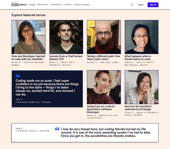
In lieu of a hero section, Codecademy’s page is topped with a row of three videos, one for a different customer.
This is followed by two rows of calls to action for featured learner stories, each one a separate, individual page.
Among these featured learner stories are two quote elements featuring text-based testimonials from Codecademy learners.
Each story and testimonial are from Codecademy learners who went on to become professional web developers and designers.
At the bottom of the page are two additional calls to action: one encouraging you to browse the platform’s courses and another encouraging current students to provide their own testimonials.
Existing Page vs Customer Testimonial Page: Why You Should Use Both
Including a Review Collection on existing, high-converting pages is the most effective way to have your reviews work for you. However, that doesn’t mean you shouldn’t also create a dedicated customer testimonial page. I recommend creating multiple Review Collections to include in different places on your site.
Creating Your Review Collection
Let’s run through the steps of creating a Review Collection in case you only use Starfish Reviews for Review Funnels.
- Create a Review Profile
- Create a Review Collection Draft and select your desired filters
- Configure a layout, review elements, and style
- Give your collection a name and publish it
Step 1: Create a Review Profile
You need to create a Review Profile first so you have reviews to create a Collection out of.
From the WordPress dashboard, go to Starfish Reviews → Profiles → Add New.
Fill out the following details:
- Profile Name – Give your Profile a descriptive name, such as “Facebook,” “Store 1” or “Main Location.”
- Choose a Review Site – Choose the platform you want to pull reviews from with this Profile. For most platforms, all you need to do is enter your profile’s slug (the bit of text that displays after the .com/ of your profile page). This is “starfishwp” for us since our Facebook profile page URL is https://www.facebook.com/StarfishWP/.
- Make sure you click the Validate button. It’s required.
- Active/Disabled – Switch this option to Active.
- Scrape for Reviews Now? – Select this option. It will ensure Starfish Reviews pulls reviews from your chosen platform immediately so you can get to work on creating a Collection right away. You can choose how often the plugin does this by going to Starfish Reviews → Settings → Reviews. You can choose to pull in new reviews daily, weekly or monthly.
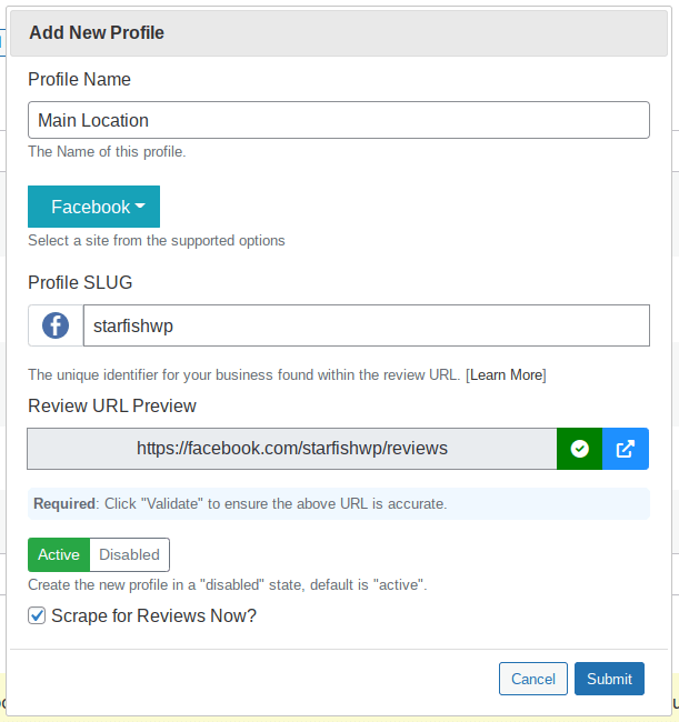
Click Submit to create your Profile.
You can create more profiles for additional platforms and locations. Starfish Reviews Premium allows you to create between 5 and an unlimited number of Profiles depending on which plan you have.
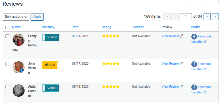
Go to Starfish Reviews → Reviews to monitor the reviews the plugin has imported for you.
You can switch individual reviews from Visible to Hidden. This is useful for reviews that have spam text or no text.
Step 2: Create a Review Collection Draft and Select Your Desired Filters
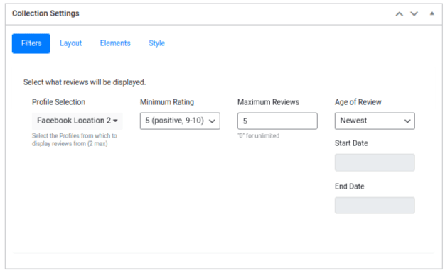
Go to Starfish Reviews → Collections → Add New, then scroll down to the Collection Settings panel.
The Filters tab is selected by default. Configure the following settings:
- Profile Selection – Select up to 2 Review Profiles to display in your Collection.
- Minimum Rating – Select the minimum rating reviews must have in order to appear in the Collection. It’s best to choose 5 so only your best reviews show. Choose 4 if you don’t have many reviews to work with.
- Maximum Reviews – Leave this set to 25. This ensures only your most recent reviews show up in your Collection.
- Age of Reviews – Leave this set to Newest.
Name your Collection, then click Save Draft.
A preview of your Collection will appear in the Collection Preview panel. Click Save Draft whenever you want to view your changes.
Step 3: Configure Layout, Review Elements, and Style
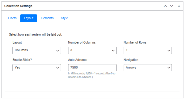
Define the number of columns and rows you want your Collection to have. Columns are vertical while rows are horizontal, just like in a spreadsheet.
Generally, a 3-column/1-row layout works well for short to medium reviews, but I suggest sticking to a 1-column/1-row layout if your reviews are longer.
Switch the Slider option to Yes. This allows you to show more reviews without having to display too many reviews at a time.
Feel free to experiment with the Auto-Advance setting. It controls how fast the slider switches to the next set of reviews.
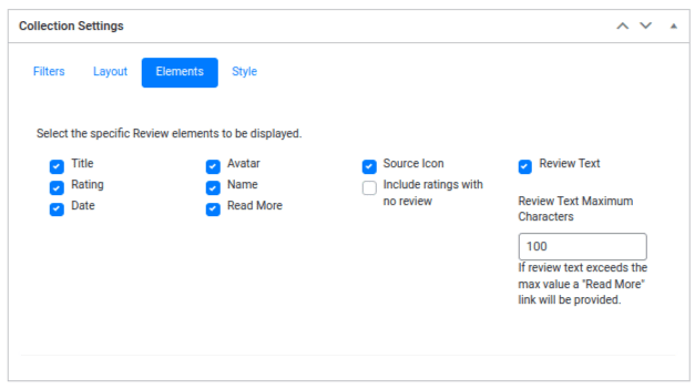
The Elements tab enables you to choose which parts of a review to showcase in your Collection.
The default selections make for a cleaner layout design, but you can experiment by selecting and deselecting different options.
Just be sure to keep the following elements for credibility:
- Rating
- Date
- Avatar
- Name
- Review Text
The Source Icon is good for credibility as well.
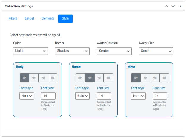
Style options are up to you as well. Here’s what we chose:
- Light color
- Shadow border
- Centered avatar position
- Small avatar size
- 14px font size for Body, Name and Meta
- Bold font style for Name
- Centered Name text
Step 4: Give Your Collection a Name and Publish It
Give your Collection a name if you haven’t yet, then click Publish.
Now you have a Collection suitable for all use cases.
Let’s go over the best places to use them.
How to Add a Review Collection to Your WordPress Site
All you need is your Collection’s shortcode to insert it on a page on your WordPress site.
There are two places to find this shortcode:
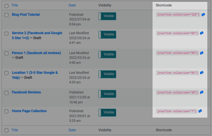
- On the main Collections page at Starfish Reviews → Collections. There’s a column labeled “Shortcode.” Click the Blue button to the right of your shortcode to copy it.
- On the Edit page for your Collection. It’s in the Collection Toolbox panel on the right side of the page. Like the first method, click the Blue button to copy the shortcode.
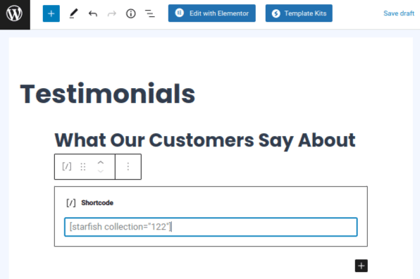
To add this shortcode to a Gutenberg post/page, paste it into the block editor’s Shortcode block.
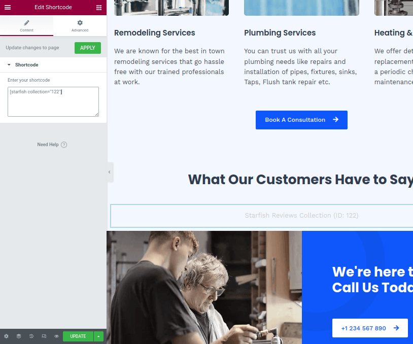
To add this shortcode to an Elementor page, use Elementor’s Shortcode element. The Text Editor element works as well.
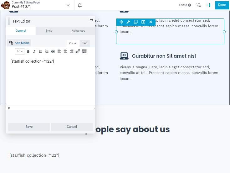
The “Text” or “Text Editor” module also works with most other page builders. Here’s Beaver Builder as an example:
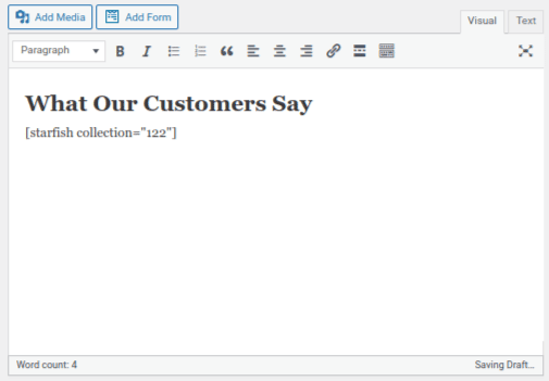
And finally, if you’re using the Classic Editor, simply paste the shortcode wherever you’d like to feature your Collection.
How to Add a Review Collection to an Existing Page
Here are the top existing pages we recommend displaying a Review Collection on:
Here are the top three pages you should add a Collection to:
- Homepage – Insert a Collection after the features/services section of this page but before your pricing table/call to action (CTA).
- Pricing/CTA Page – Your prices/pricing table should always be at the top of a pricing page. Include a Collection beneath this table. If you only have a CTA page, such as a page where potential customers can request a quote, place your Collection underneath the contact form or CTA.
- Features/Services Page – Include a Collection after you describe each feature/service you offer.
Other contenders include landing pages and any promotional pages you create for sales and new products/features/services. Follow the same rule as before: insert a Collection after you’ve explained features/services but before you list prices/CTAs.
Your homepage should have a section that lists your features and/or services. Your pricing table should be featured after this, just before your footer.
Use a CTA instead if you don’t offer fixed prices. Examples of CTAs include “Call now to book an appointment, “Request a quote,” etc.
Include your Collection between your features/services section and your pricing/CTA section. This works on your Features/Services page as well.
Of course, you can place other elements on the page as well. Just make sure your testimonials are listed after you explain your features/services and before you ask customers to buy.
Here’s what this looks like:

For a Pricing page, paste the shortcode beneath your pricing table, like this:
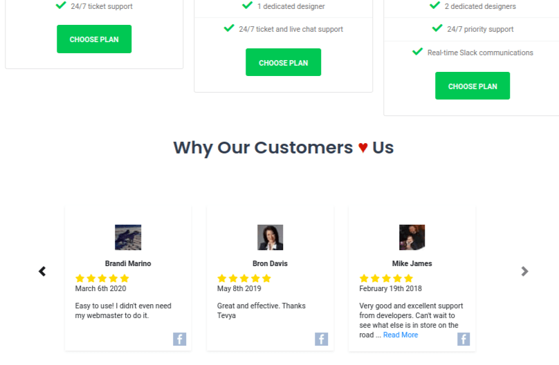
Add an attention-grabbing title above your Collection, such as “What Our Customers Say” or “Why Our Customers Love Us.” Consider using a heart emoji in place of the word “love” to make the title pop.
If you don’t offer fixed prices or don’t list your prices online, add your Collection to the page potential customers use to get in contact with you.
Here’s how this looks beneath a contact form:

Creating a Customer Testimonial Page with a Review Collection
To create your very own customer testimonial page, use a page builder like Elementor or get a plugin like Spectra, which adds advanced blocks to the block editor.

Your theme may have its own page builder, or it may use another solution like Beaver Builder.
I’m using Elementor in the screenshots below.
However, before you get to work on designing your page, I recommend taking the time to get to know your customer base.
As we saw from the examples earlier in the article, customer stories make for powerful additions to a customer testimonial page.
Your most frequent customers or customers who’ve spent the most amount of money with you are your best bet.
Use the form of communication you normally use to communicate with them to ask if they’d like to be featured on your website.
Ask how your products or services have helped them or their businesses or how they use them in their daily lives.
Try to get at least three customer stories. You can take videos of them (like Hotjar) or interview them, then turn the interviews into individual pages (like Codecademy).
Get their picture for the latter option.
Now, let’s go over how to use a Collection and customer stories to build a customer testimonial page.
The Hero Section
There are three primary designs we can use here:
- Customer story with CTA
- Introduction with CTA
- Collection with CTA
Let’s look at examples of each.
Here’s a customer story hero section that includes a call to action:

Here’s an example with a heading that introduces the page. It also uses a call to action:

You can also use videos in place of images.
Elementor supports YouTube, Vimeo and Dailymotion. Don’t upload videos directly to your WordPress site. This eats at server resources.
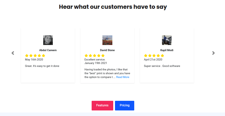
And finally, here’s an example that uses a Collection in the hero section as well as a call to action:
The Body Section
I’m going to place my customer stories beneath the hero section.
You can use a slider for this like Hotjar did. However, because the Collection I’m using has a slider enabled, a static row will create the right amount of contrast I’m looking for.
I’ll include the Collection beneath my row of customer stories with the heading “Reviews from Around the Web.”
Here’s how this layout looks:
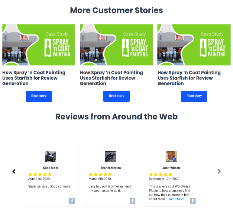
This layout works for an introduction design as well. You just need to change the “More Customer Stories” heading to “Customer Stories” since that design’s hero section doesn’t include a customer story.
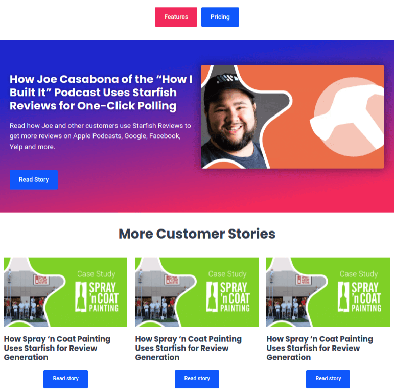
If you use a collection in your hero section, only include the customer stories section. Don’t place another Collection on the page unless it has a specific purpose. An example would be a Collection that only shows reviews from Facebook. You can then use the heading “Reviews from Facebook” instead. It also may be a good idea to include a featured customer story before your row of customer stories, like this:
The Call to Action
Finally, end your page with a call to action that suits your business type.
Here’s an example:
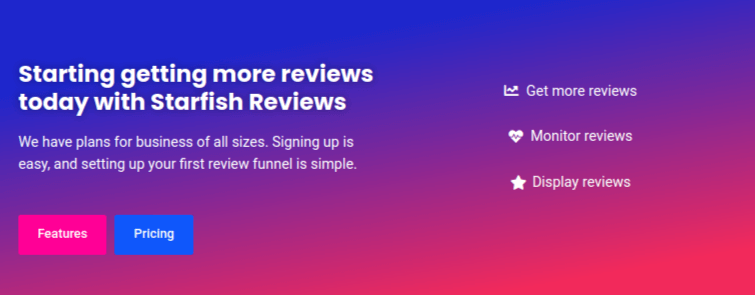
Example PDF & Template Available for Download
Subscribe to Starfish Reviews now to receive the Customer Story with CTA page as a PDF cheatsheet and an Elementor template you can use on your own website.
Here’s how to use the Elementor template. Keep in mind the template will look different on your site since Elementor inherits your theme’s styles:
1. Create a new WordPress page
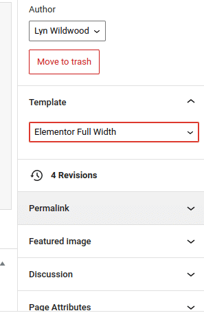
2. Choose Elementor Full Width as a template in the right sidebar panel:
3. Click the Edit with Elementor button
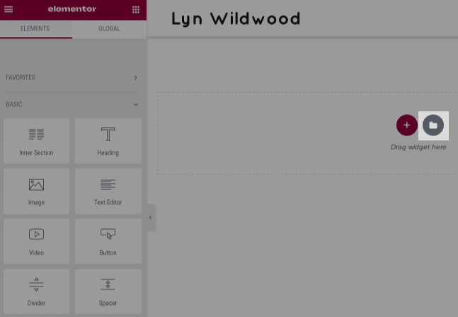
4. Click Add Template:
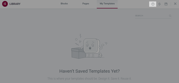
5. Click the Import Template button:
6. Select the JSON file you downloaded from us
7. Click Enable and Import
8. Click Insert:
9. Click Apply Settings.
With the template imported, switch out our placeholder text, images and URLs for your own.
You should also replace the Starfish Reviews Collection shortcode with your own.






0 Comments